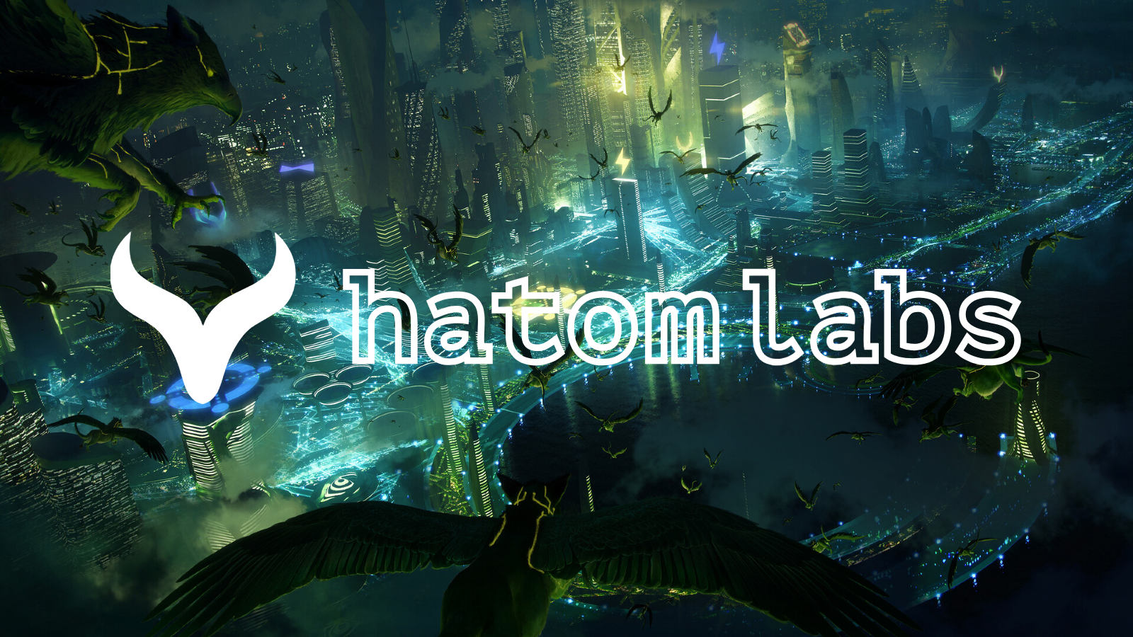
Context
Hatom Labs needed a digital showcase that could make a blockchain/token ecosystem feel tangible, visual, and accessible — not just another abstract whitepaper site. The audience ranged from token holders to potential partners, so clarity and visual polish mattered.
Contribution
I worked across design and front-end implementation: shaping the visual direction from brand materials, translating the token ecosystem into an intuitive visual hierarchy, and building responsive UI patterns that communicated the project clearly across devices. The site needed to work for desktop browsing, mobile-first audiences (common in Web3), and large screens where the visual showcase had the most impact.
What I built:
- A responsive React frontend with component-driven architecture
- Visual token showcase UI that made abstract blockchain concepts tangible
- Brand-aligned design system (colors, typography, component patterns)
- Mobile-first responsive layout for the Web3 audience
What this demonstrates
- Product-minded front-end delivery. I don’t just implement designs — I consider what the user needs to understand and act on.
- Ability to communicate technical ecosystems visually. Blockchain/token concepts are hard to grasp. The site’s job was to make them feel real, and it succeeded.
- Comfort at the intersection of branding, UI, and web implementation. Started from brand direction, ended with production code.
- Practical execution for Web3-adjacent teams. Built for a real audience with real constraints — not a demo, not a tutorial.
Semantic Connections